Logo
Our Logo
Our logo is our brand’s most important element. It is a unique and bold signifier of the Dicoding brand.
Our logo is our brand’s most important element. It is a unique and bold signifier of the Dicoding brand.
Primary Logo
The Dicoding “g” mark represents a cursor highlighting text, a symbol of curiosity, discovery, and the pursuit of knowledge. It embodies the spirit of growth and continuous learning, reflecting how developers interact with code, explore new ideas, and sharpen their skills.
The Dicoding “g” mark represents a cursor highlighting text, a symbol of curiosity, discovery, and the pursuit of knowledge. It embodies the spirit of growth and continuous learning, reflecting how developers interact with code, explore new ideas, and sharpen their skills.
Symbol
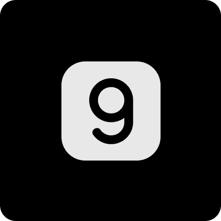
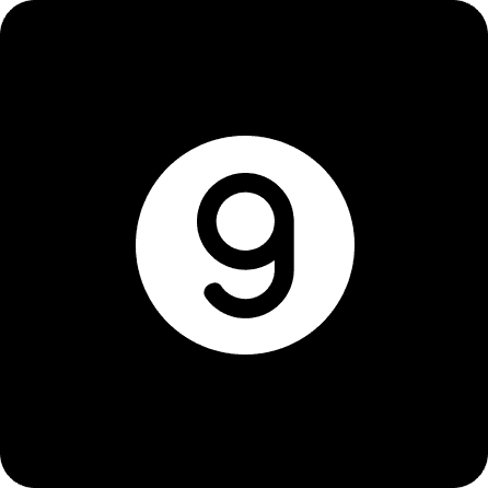
The “g” symbol is the most minimal representation of Dicoding. It should be used in contexts where the full word mark “Dicoding” is already present or where the brand is clearly understood without it.
The symbol also serves as our app icon, social media profile image, and favicon.
To preserve clarity and consistency, the “g” symbol should always remain solid, its form and proportions must never be altered.
The “g” symbol is the most minimal representation of Dicoding. It should be used in contexts where the full word mark “Dicoding” is already present or where the brand is clearly understood without it.
The symbol also serves as our app icon, social media profile image, and favicon.
To preserve clarity and consistency, the “g” symbol should always remain solid, its form and proportions must never be altered.

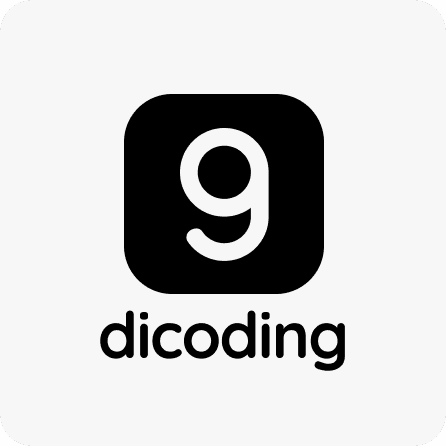
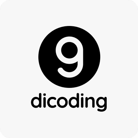
Monochrome Logo
We know that bringing a creative vision to life sometimes involves navigating unique design challenges, whether it's a vibrant background or strict printing limits. To give you the flexibility you need while keeping the Dicoding brand strong, we’ve crafted elegant monochrome (single-color) versions of our logo.
When to Use Monochrome
Vibrant Canvases: When our primary colors clash with your background design.
Print Limitations: For seamless black-and-white or single-color production.
Finding the Perfect Contrast You have crisp black and pristine white options at your fingertips. Trust your eye and select the version that creates the most striking contrast, ensuring the design remains beautifully clear and perfectly legible!
We know that bringing a creative vision to life sometimes involves navigating unique design challenges, whether it's a vibrant background or strict printing limits. To give you the flexibility you need while keeping the Dicoding brand strong, we’ve crafted elegant monochrome (single-color) versions of our logo.
When to Use Monochrome
Vibrant Canvases: When our primary colors clash with your background design.
Print Limitations: For seamless black-and-white or single-color production.
Finding the Perfect Contrast You have crisp black and pristine white options at your fingertips. Trust your eye and select the version that creates the most striking contrast, ensuring the design remains beautifully clear and perfectly legible!
Clear Space
Give Our Logo Room to Breathe
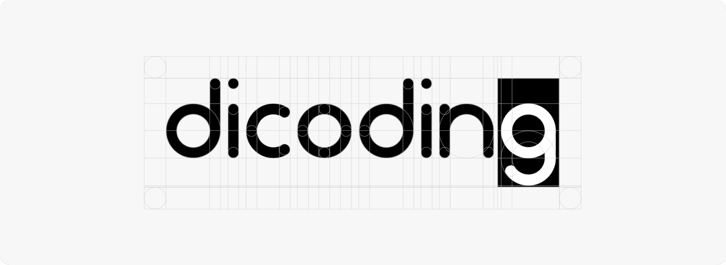
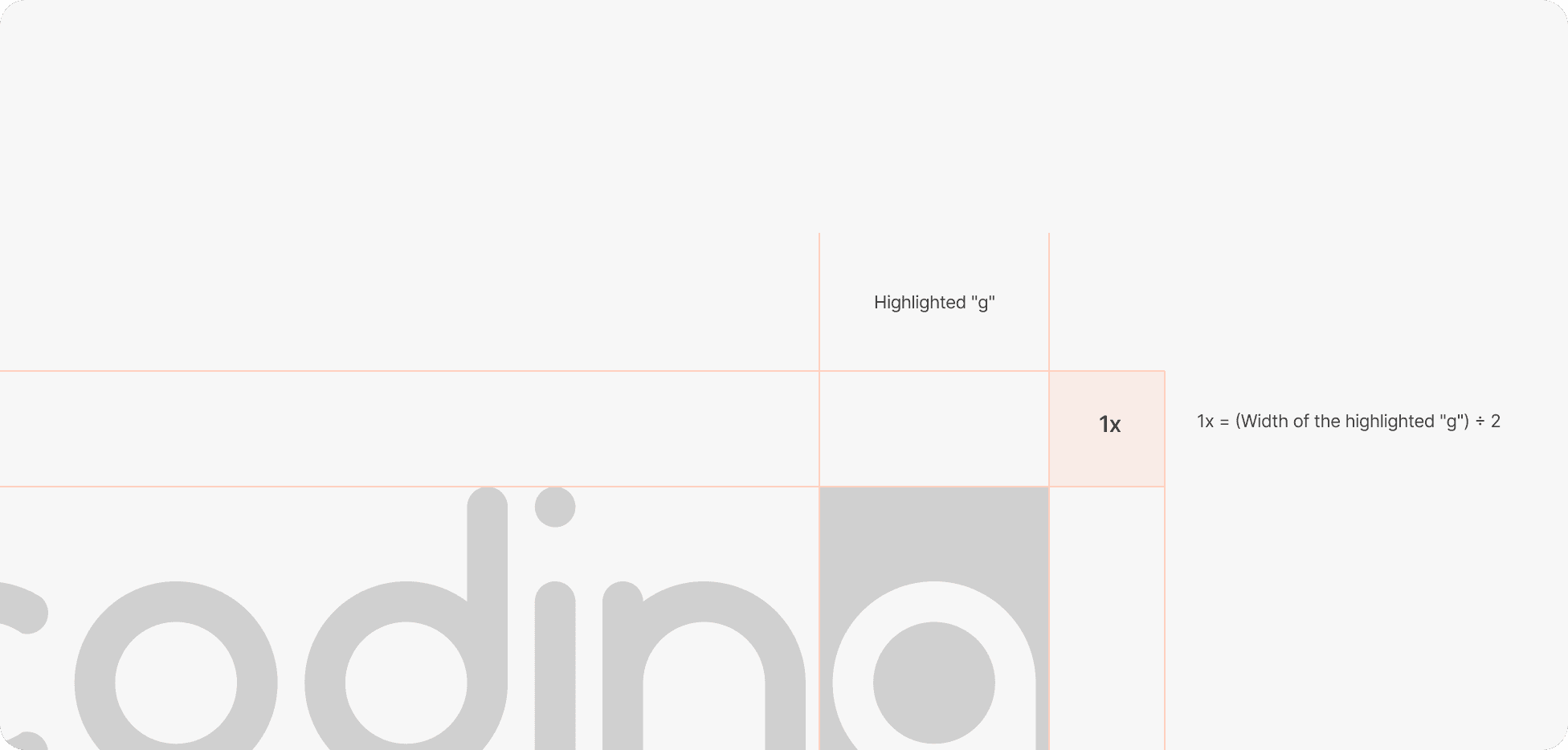
To ensure the Dicoding brand always shines, we surround it with a protective margin called "clear space." This keeps our identity beautifully distinct and impactful!
The Simple Formula
1x = (Width of the highlighted "g") ÷ 2
By using exactly half the width of our "g" as your standard unit (1x), calculating this space is effortless.
How to Apply It
Always maintain a minimum 1x margin on all four sides of the logo. Just keep this zone completely free of text, graphics, or borders, and our brand will always look its absolute best on any canvas.
Give Our Logo Room to Breathe
To ensure the Dicoding brand always shines, we surround it with a protective margin called "clear space." This keeps our identity beautifully distinct and impactful!
The Simple Formula
1x = (Width of the highlighted "g") ÷ 2
By using exactly half the width of our "g" as your standard unit (1x), calculating this space is effortless.
How to Apply It
Always maintain a minimum 1x margin on all four sides of the logo. Just keep this zone completely free of text, graphics, or borders, and our brand will always look its absolute best on any canvas.
Logo color
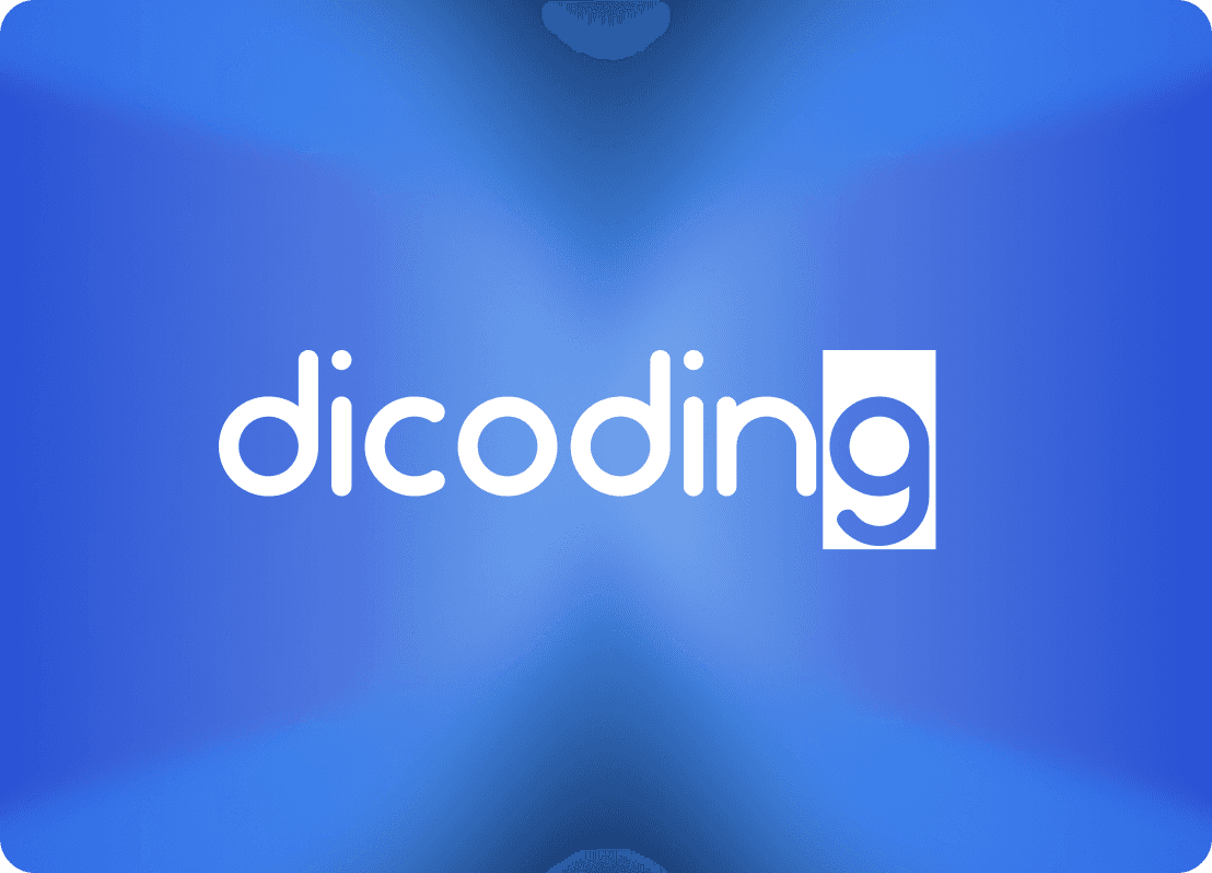
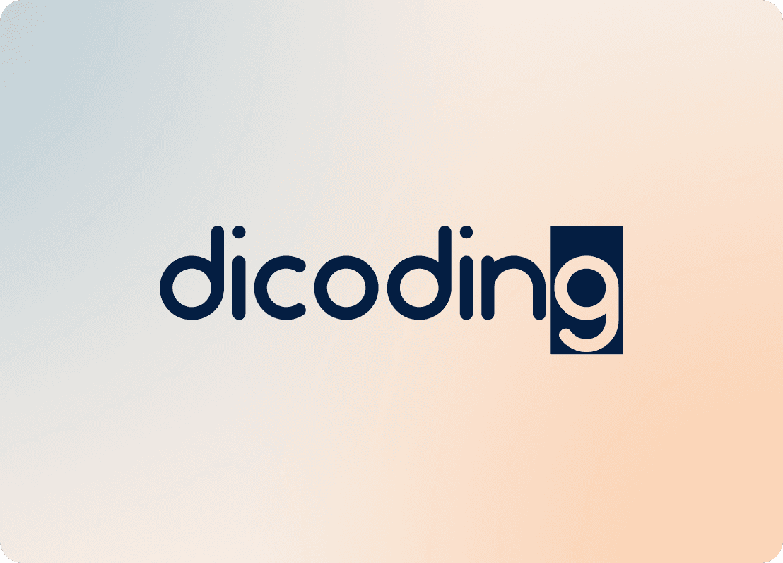
To ensure the Dicoding logo always shines, use Brand Light or Brand Dark. Trust your brilliant creative eye for striking contrast!
Light Backgrounds: Use a Brand Dark or Indigo logo.
Dark Backgrounds: Let the Brand Light logo beautifully pop.
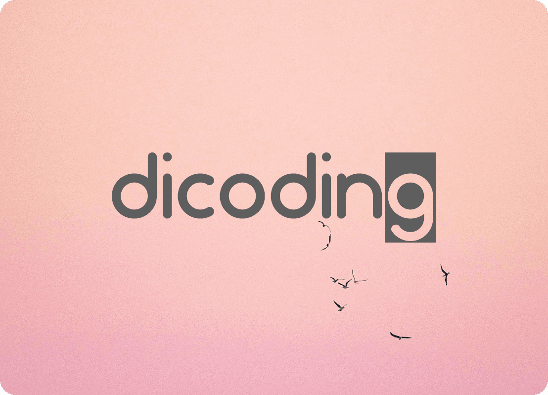
Photography: Choose light or dark, ensuring crystal clarity.
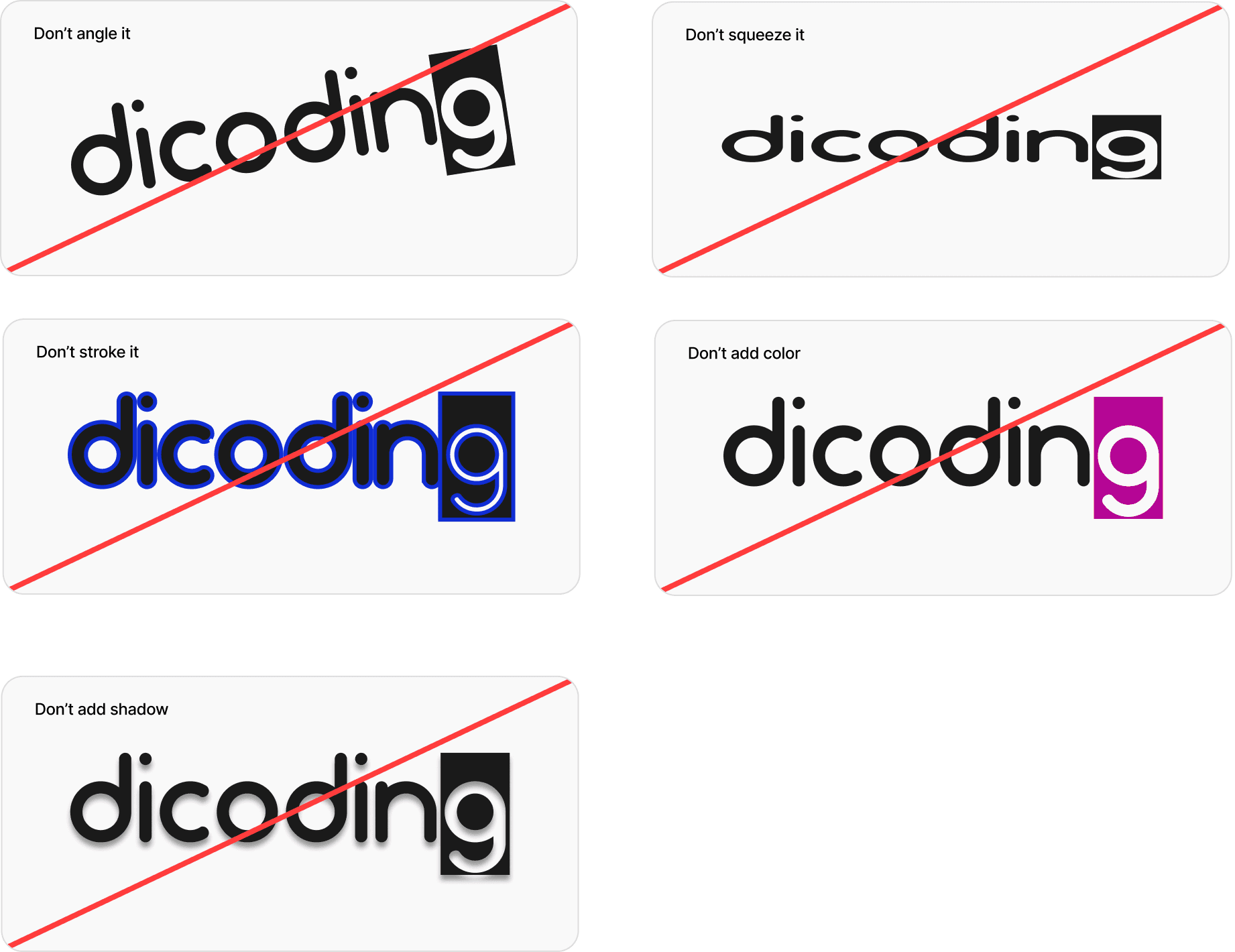
To preserve our core identity, never apply secondary colors directly to the logo.
To ensure the Dicoding logo always shines, use Brand Light or Brand Dark. Trust your brilliant creative eye for striking contrast!
Light Backgrounds: Use a Brand Dark or Indigo logo.
Dark Backgrounds: Let the Brand Light logo beautifully pop.
Photography: Choose light or dark, ensuring crystal clarity.
To preserve our core identity, never apply secondary colors directly to the logo.
Logo usage
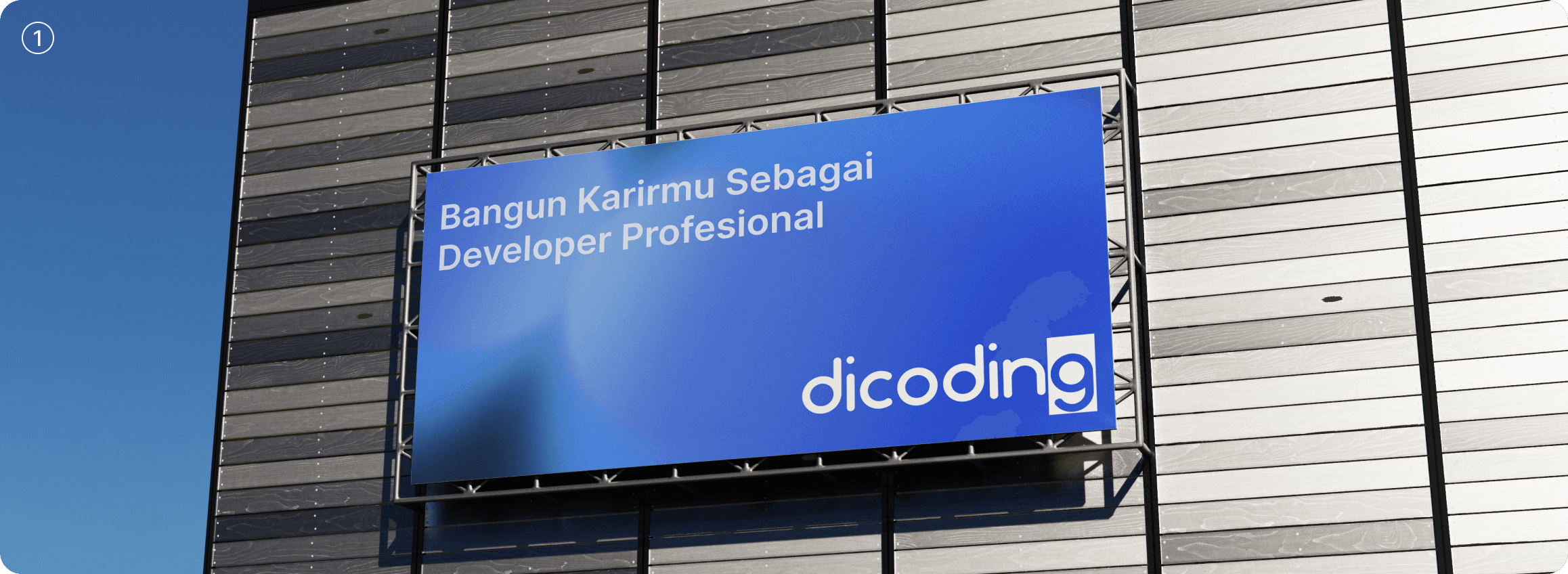
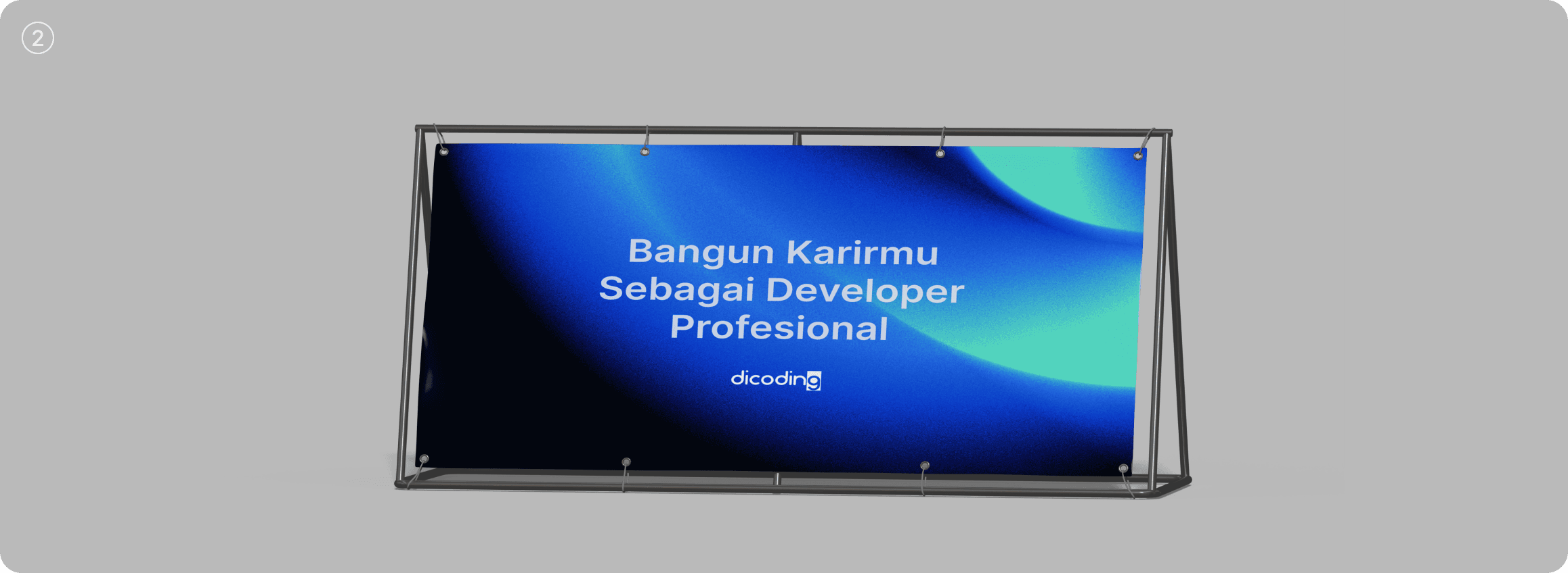
The Dicoding logo can be used as a primary or supporting element in a composition.
When used as the main focus, it should lead the visual story with confidence and clarity. When used secondarily, it should complement text or imagery without competing for attention.
Always pay attention to size, spacing, and contrast to maintain balance. The logo and surrounding elements should feel harmonious, distinct, but never identical in weight or focus.
The Dicoding logo can be used as a primary or supporting element in a composition.
When used as the main focus, it should lead the visual story with confidence and clarity. When used secondarily, it should complement text or imagery without competing for attention.
Always pay attention to size, spacing, and contrast to maintain balance. The logo and surrounding elements should feel harmonious, distinct, but never identical in weight or focus.
1
Logo as primary element
2
Logo as secondary element
Our Logo, Our Identity
Our logo is one of Dicoding’s most important brand assets.
It represents our mission, our community, and the spirit of learning we stand for.
Please treat it with care and consistency across every application, from tone of voice to color, layout, and typography.
Thank you for helping us protect and honor the Dicoding brand.
Our logo is one of Dicoding’s most important brand assets.
It represents our mission, our community, and the spirit of learning we stand for.
Please treat it with care and consistency across every application, from tone of voice to color, layout, and typography.
Thank you for helping us protect and honor the Dicoding brand.
Dicoding Brand Guidelines
These guidelines were crafted by the Creative at Dicoding
A collective of designers, writers, and engineers dedicated to ensuring a seamless and impactful experience across our entire developer ecosystem. We are the guardians of the Dicoding identity, ensuring that every touchpoint, from our learning platform to our community events, reflects our commitment to elevating Indonesia’s tech talent with clarity, authority, and innovation.
Contact Us
design@dicoding.com
design@dicoding.com